DESCRIPTION
DBpedia offers large quantities of structured data in many variants which are then picked up and hosted by language/national chapters and sub communities such as the http://es.dbpedia.org or http://de.dbpedia.org
One of the big challenges here is to improve visibility and provide a good overview over all these individual online knowledge graphs. Hence we need a dashboard/overview where visitors and new users can quickly check what is loaded.
Goal
Visualize the individual knowledge graphs provided by chapters and other sub communities.
Impact
New users (and also community members) can get a quick overview over the available data in the different SPARQL endpoints, which is excellent for showing the impact of the DBpedia effort as a whole.
Basic visualisation
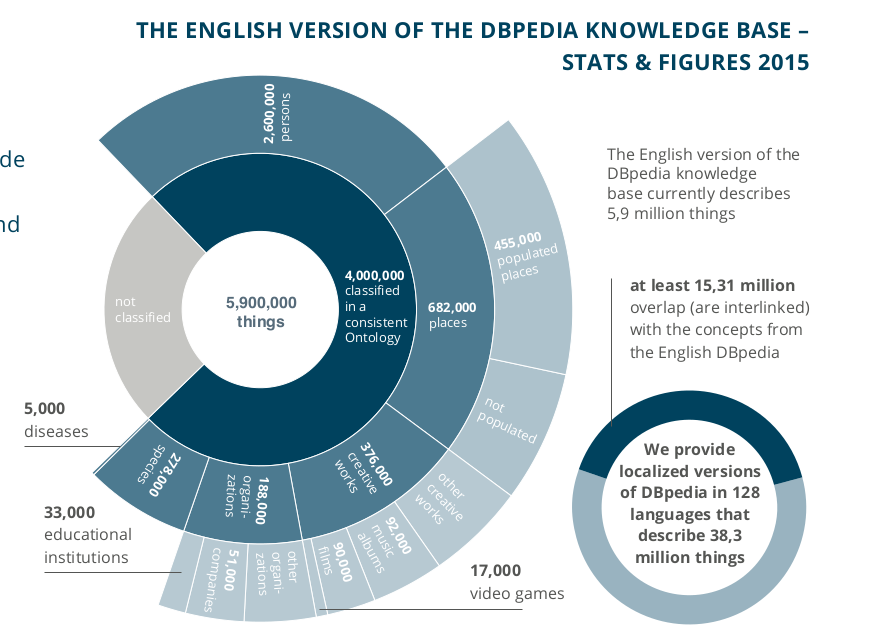
above is a screenshot from an old flyer for orientation, this can be generated automatically, either via SPARQL or creating a custom index. The image was done before cool libs such as https://d3js.org/ existed. I would consider having one such visualisation a definite baseline requirement.
Further inspirational ideas
Pick some at leisure or invent new ones:
- collection: Chapters and the main endpoint will soon be loaded from Databus collections using DBpedia Dataset 2019-08-30 (Pre-Release) and Docker. The Databus collection shows the sources, i…e. data sets loaded to make up the graph. This can be visualised and also some help can be provided how to add new non-Wikipedia sources as has been done with Yago, LHD, SDTypes, sameAs Links, etc.
- measure of connectivity DBpedia is the crystallization point for linked data at the center of the LOD-Cloud. Each Chapter is a crystallisation point for national/language-specific LOD and this can be visualised by reusing tools and data from http://lod-cloud.net/ to show how well the chapter graphs are connected. This can also give guidance to users that want to add link sets.
- visualise growth and health data evolves over time and there could be a nice statistic based on previous collections to show what evolves well in terms of size and quality. This becomes especially important as soon as new external national data sources are included, e.g. Data about Brazilian cities , IBGE data.
- mapping guide visitors of the dashboard to edit the mappings or add axioms to the ontology and mappings wiki to improve the data. This could show places where edits are needed.